Code · April 14, 2026 · 2 min read
I built a histogram to stop arguing with my light meter
Building an RGB histogram from scratch in the browser, and what it turned up about my own photos.
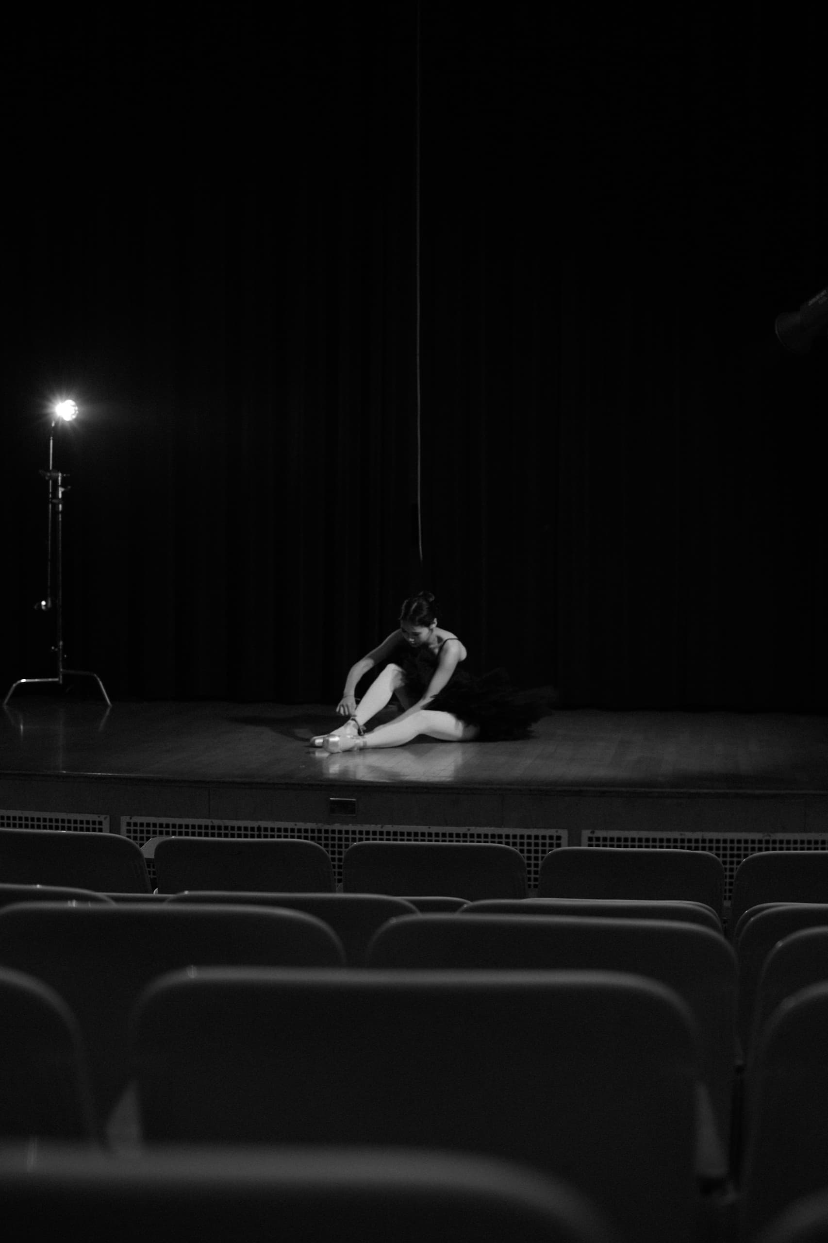
Black and white: a performer alone at the edge of a dark stage under a single hanging light, empty seats in the foreground.
My camera has a histogram. My editing software has a histogram. So naturally I built a third one, in the browser, from scratch, because the developer half of my brain does not trust any chart it did not draw itself.
The whole trick is one method
Everything on the Code page starts with getImageData. Draw the photo to a canvas, ask for the bytes, and suddenly a photograph is just a very long array wearing a nice outfit:
const canvas = document.createElement('canvas')
const ctx = canvas.getContext('2d', { willReadFrequently: true })
ctx.drawImage(img, 0, 0, width, height)

const { data } = ctx.getImageData(0, 0, width, height)

// data is [r, g, b, a, r, g, b, a, ...]
const bins = { r: new Uint32Array(256), g: new Uint32Array(256), b: new Uint32Array(256) }
for (let i = 0; i < data.length; i += 4) {
  bins.r[data[i]]++
  bins.g[data[i + 1]]++
  bins.b[data[i + 2]]++
}
That loop is the entire histogram. Everything after it is typography.
A photograph is a few million numbers wearing a nice outfit.
Square roots make nicer mountains
Raw counts produce a histogram with one smug spike and a flatline, because most photos have a lot of one thing. Scaling each bar by its square root compresses the peaks and lifts the valleys, which is not scientifically rigorous and is visually honest. The print histograms in old darkroom manuals did something similar by eye.
What the palette taught me
The dominant-color strip uses the same pixel array, bucketed to 4 bits per channel and ranked by count, with a minimum distance rule so you get five colors instead of five beiges. Running it on my own portfolio was mildly humbling: my "varied" body of work is apparently forty shades of cream and walnut. The site palette chose itself; I just wrote it down.
The moral, if there is one: measure the thing you love. Worst case, you learn it is exactly what you thought. Best case, you get a chart.